Content Creator
Education Hub
In this project I worked with a large team. I acted as the UX lead alongside several other leads including Content, Visual Design, SEO, Marketing and Developers.
Overview
The Problem:
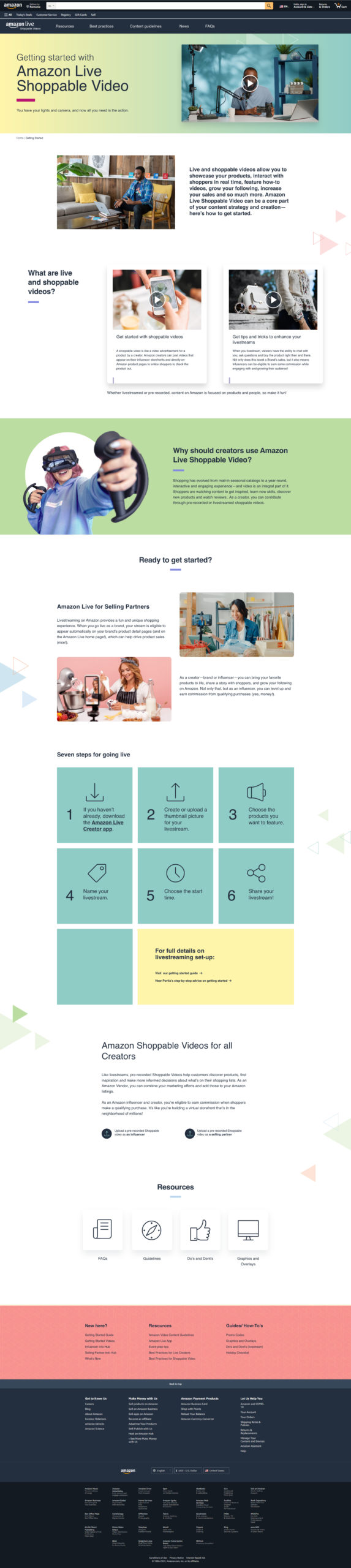
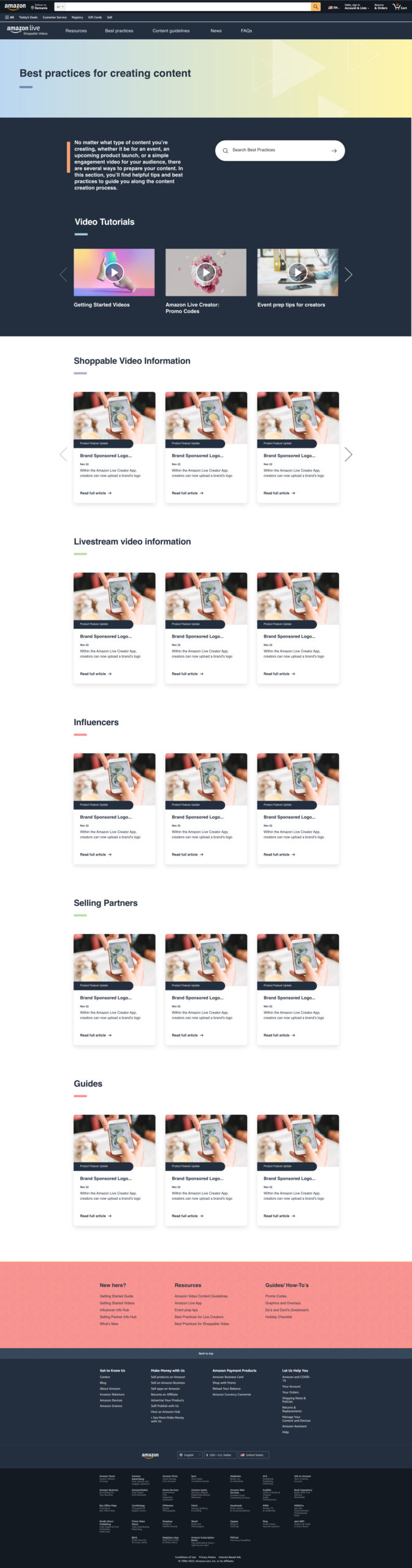
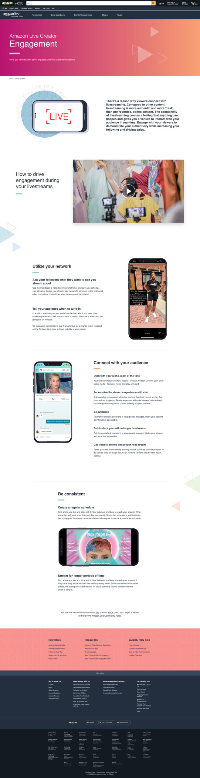
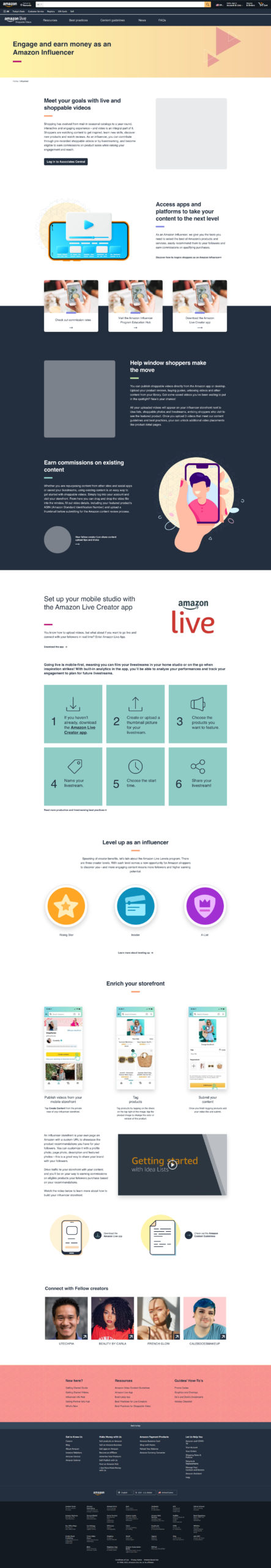
The client had an existing public-facing site aimed to inform and educate influencers, brands, and sellers on how to get the most out of using the existing tools (particularly videos) to promote products on this selling platflorm. The existing site was not cohesive or user-friendly.
The client wants to bring their two shoppable video types together by combining content from the two existing programs: store front video and livestream video.
The Solution:
The site needed a content audit and a new information architecture. The navigation and page layouts all needed to be updated in a way that helped the site become more organized and user-friendly for content creators. This all needed to be done within limiting parameters of the site's existing content management platform and still make sense while combining content about the two different video types.
My Role:
I acted as UX lead for this project and collaborated with the content and developer teams to create all project deliverables.
Research
Primary Research:
For the discovery phase of this project, I worked in tandem with our content team to gather information from the client to help guide all decisions moving forward. There were a lot of stakeholders with conflicting opinions on this project and what was needed to be done, but we banded together as a team and set out to impress.
The client declined competitive analysis stating that they had no competition in the industry.
Some of the pain pain points uncovered during discovery were:
- too much long form text
- too much internal jargon that needs to be replaced with a relateable voice
- lots of contradictory information, confusing to users
- pages are not cohesive
Analysis
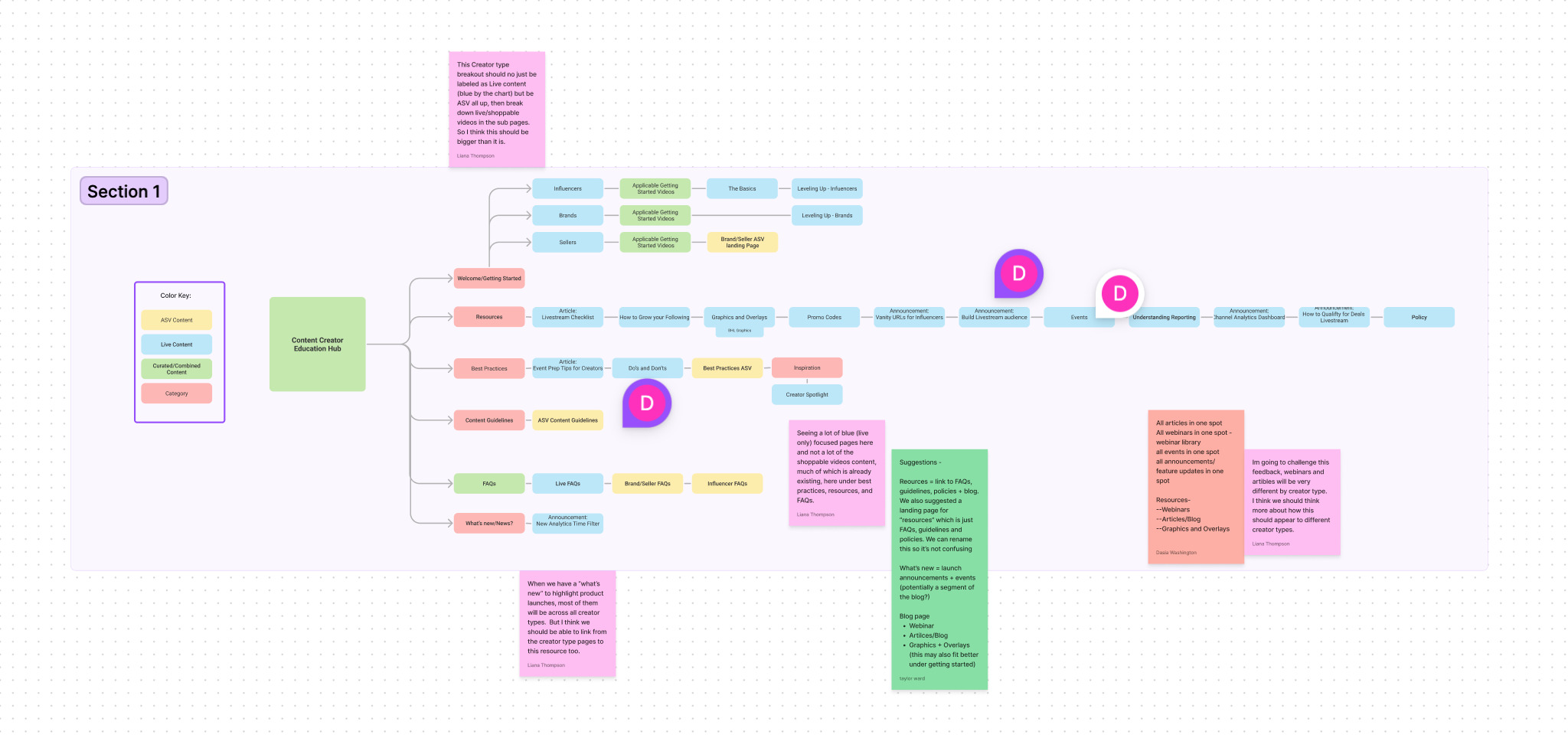
User Flow:
While the content team created an invetory of all existing pages, I worked on a fig jam document to showcase a new user flow structure that helped user flow through site.
I divided the existing pages into the following categories:
- Welcome/Getting Started
- Resources
- Best Practices/Guidance
- What's New/News
I created a second user path that the client requested that catetered to users by their two main persona types:
- Influencers
- Selling Partners
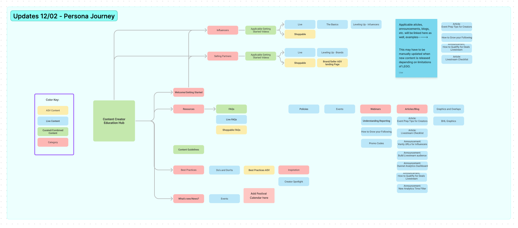
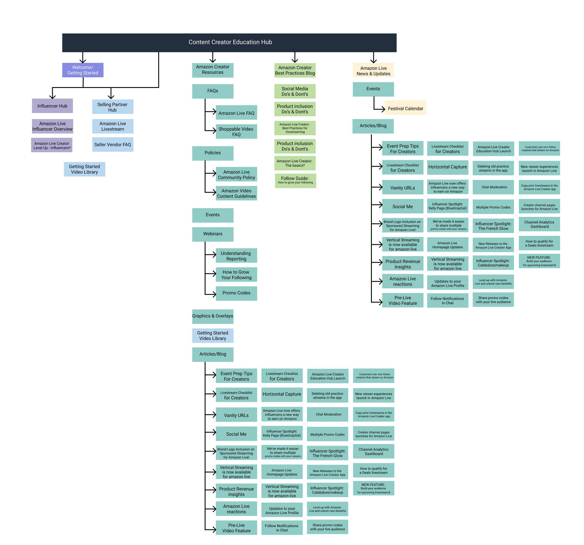
Information Architecture
I used figma to create an official Information Architecture document that encompassed all pages (new and existing) for the updated site.
Ideation/Design
Wireframes
Once the client agreed on a site structure, I jumped right into wireframes. I began by defining all of the necessary page templates.
- Hub Page
- Persona-based landing page
- Basic landing page
- What's New page (news)
- Article page
- FAQ page
- Resource Library
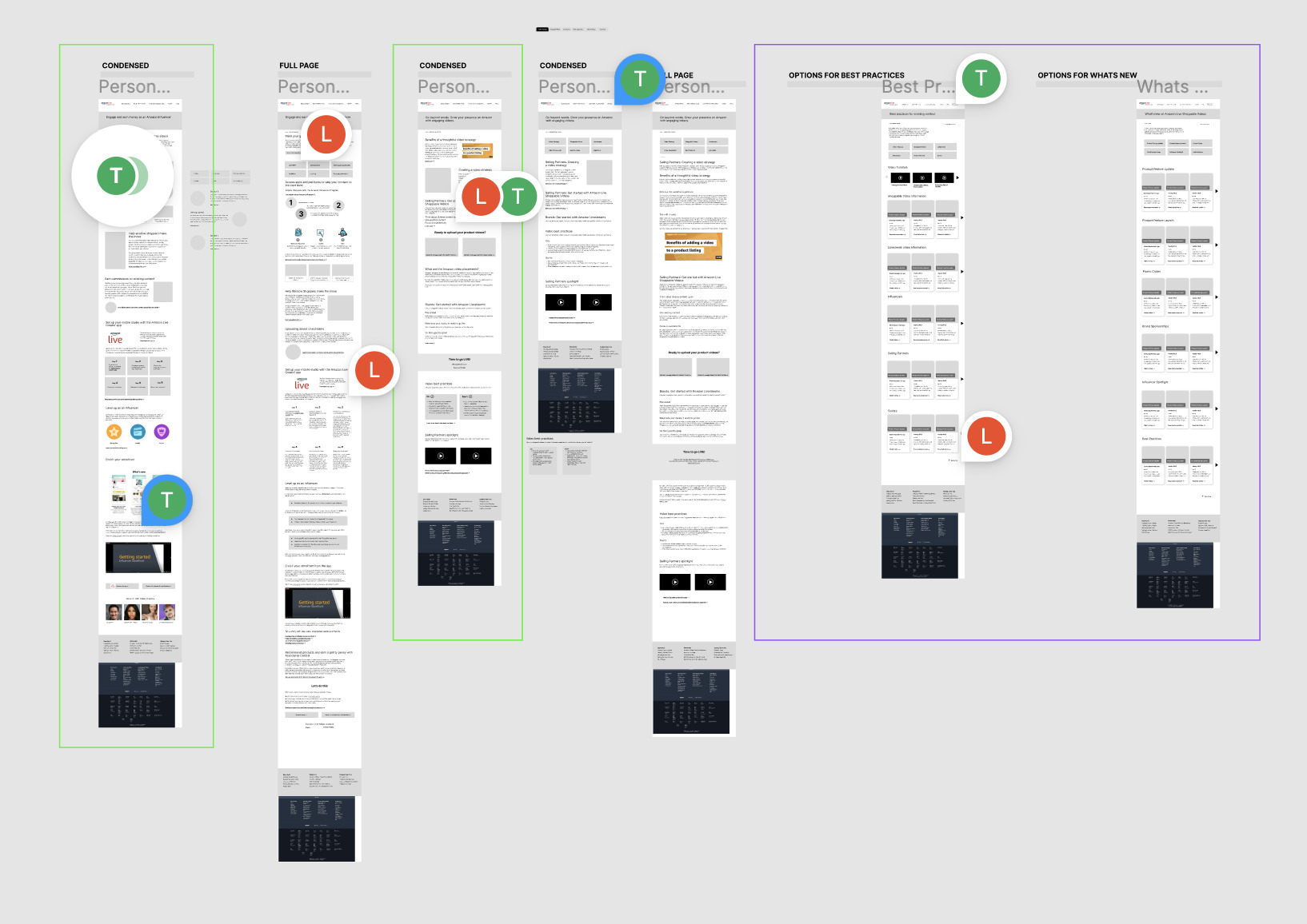
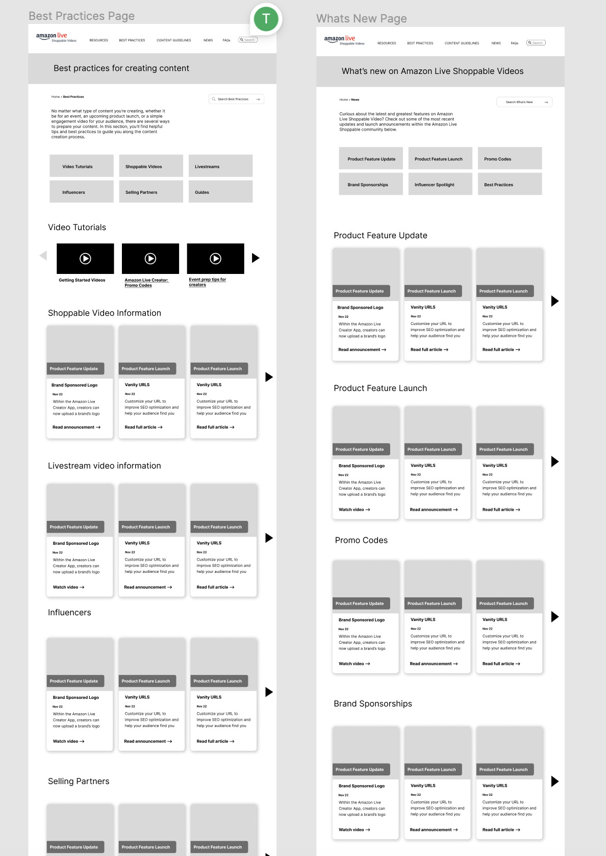
Unfortunately I had to design these pages without knowing the capabilities and limitiations of the site builder that the client uses. I proposed a lot of tagging and searching features for the site that would increase usability, but none of these were possible. These included news and resources. I ended up instead having to create long scrolling pages with content divided into sections. I decide to utilize anchor links since tagging/filtering/searching features were non existent on this platform.
Luckily this was a quick update because I was prepared to find out that capabilities were lacking. It did not cost the client any extra time and the project was kept on budget and schedule.
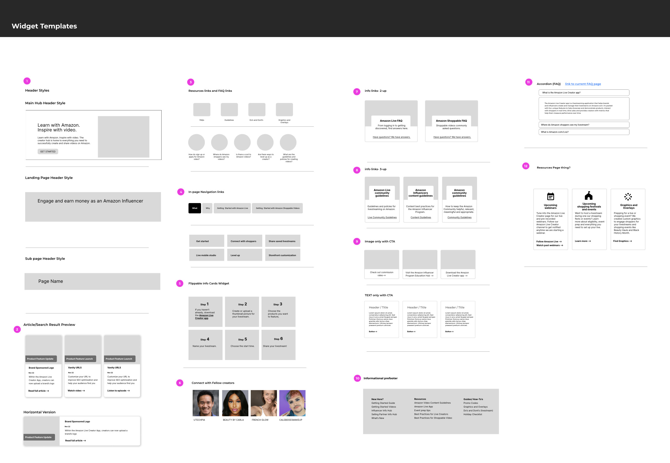
The last deliverable item from me was a widget library. This was used by the design and developer teams to keep content structure cohesive.
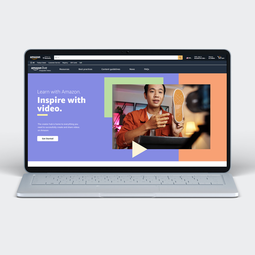
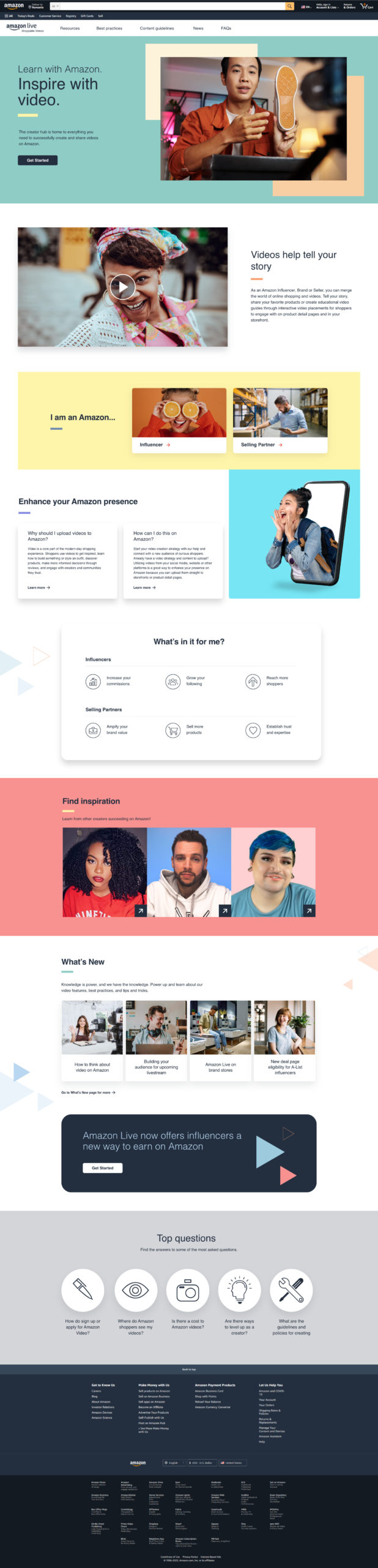
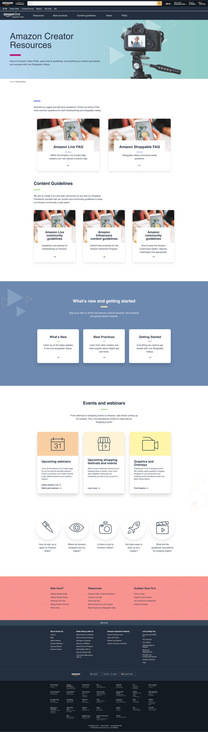
Style
The visual team took over this portion of the project once I handed off wireframes, but I wanted to include a visual of the completed project. In future projects I will remember to document the "before" state as well because the difference here is outstanding!
Conclusion
Lessons Learned:
I gained a lot from his project!
I learned to work through a lot of unknowns. The client was not able to inform us of their content management system's limitations and capabilities. I had to propose ideal solutions with the caveat that alternatives would be used if their platform lacked certain features.
This was my first project acting as UX lead. It was also the first time I had ever worked with such a large team with leads from other deparments. I really enjoyed the collaborative aspect which called for a lot of working sessions across multiple teams. I was the lone UX designer on this project, but I was fortunate to have a few extra brains to bounce ideas off of.
In the end, the client was extremely happy and said that our work on this project was outstanding.
Selected Works
For Oregon StateUX/UI Design

ZwendeCompetitive Benchmark Analysis

Content Creator Education HubUX/UI Design
BioBridgeBootcamp Capstone Project