BioBridge
This is a case study of the capstone project I created while doing my certification through Springboard's UX Design Career Track. I worked on this project intermittently from May-November of 2019.
Overview
The Problem:
Most people do not use bloodwork to measure their health because of cost, inconvenience, and lack of information and understanding. BioBridge is an app that uses technology to match users with recommended tests based on their health profile, educate users on the tests they are selecting from, book a test in a convenient location, and provide additional information with the users test results. The big design challenge was to provide these solutions without adding any additional challenges in the process.
The Solution:
The Springboard course curriculum provided the education and processes needed to conduct an entire UX-based research, design, testing and implementation for the app.
My Role:
With guidance from my assigned mentor, I conducted all research, testing, and design for the product.
Research
Secondary Research:
I began with desk research to find what kinds of blood tests people should get done regularly and why, and what a lot of the shorthand and units are for bloodwork results. I discovered that not all “normal” ranges are the same for all labwork results.
I also focused on existing technology. I looked to see what else is out there to give people a better picture of their health like the mailable testing kits offered by Everylwell(5). Ifocused mainly on two companies that utilized lab testing: InsideTracker(6) and Blueprint Fit.
I also looked at other products that run the action of askingsomeone to provide a collection of some sort to be sent off and evaluated and then returned in a way that users can easilyinterpret. The companies include Ancestry DNA, petnotics, and smart-fertilizer.
I looked at the flow of the processes and found examples of how information was evaluated, interpreted, and presented and displayed back to the client.
Primary Research:
I then sent out a screener survey to find participants to interview. I focused on finding people who meet the characteristics of someone likely to seek optimal health: doctors, athletes, people in the health field. I made sure to include health enthusiasts and smartphone users. Some of the key insights I gained through this research came from interviews.
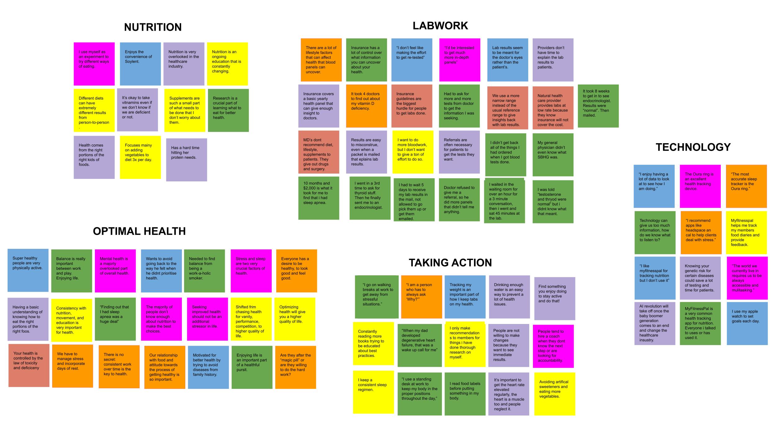
I ended up conducting 6 interviews which gave me an abundance of insights which I wrote on sticky notes and grouped into an affinity map with 5 key topics that formed organically based on the conversations I had: Nutrition, Labwork, Optimal Health, Taking Action, and Technology.
Analysis
Affinity Map:
Using notes and recordings from my interviews, I pulled numerous insights and grouped them into organic categories to create an affinity map.
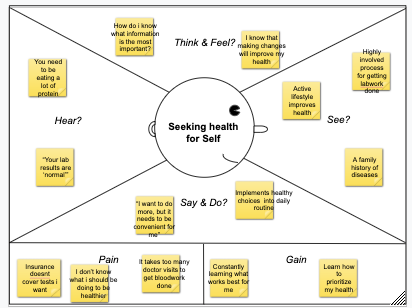
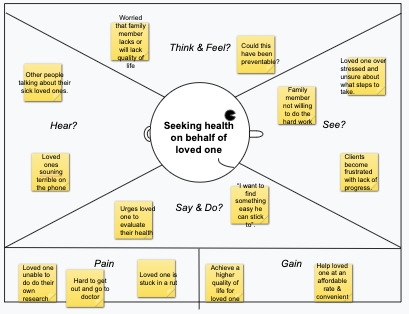
Empathy Maps:
I created some Empathy maps to help me understand potential users better. I decided to break my potential users into three groups:
- They seek health for themselves
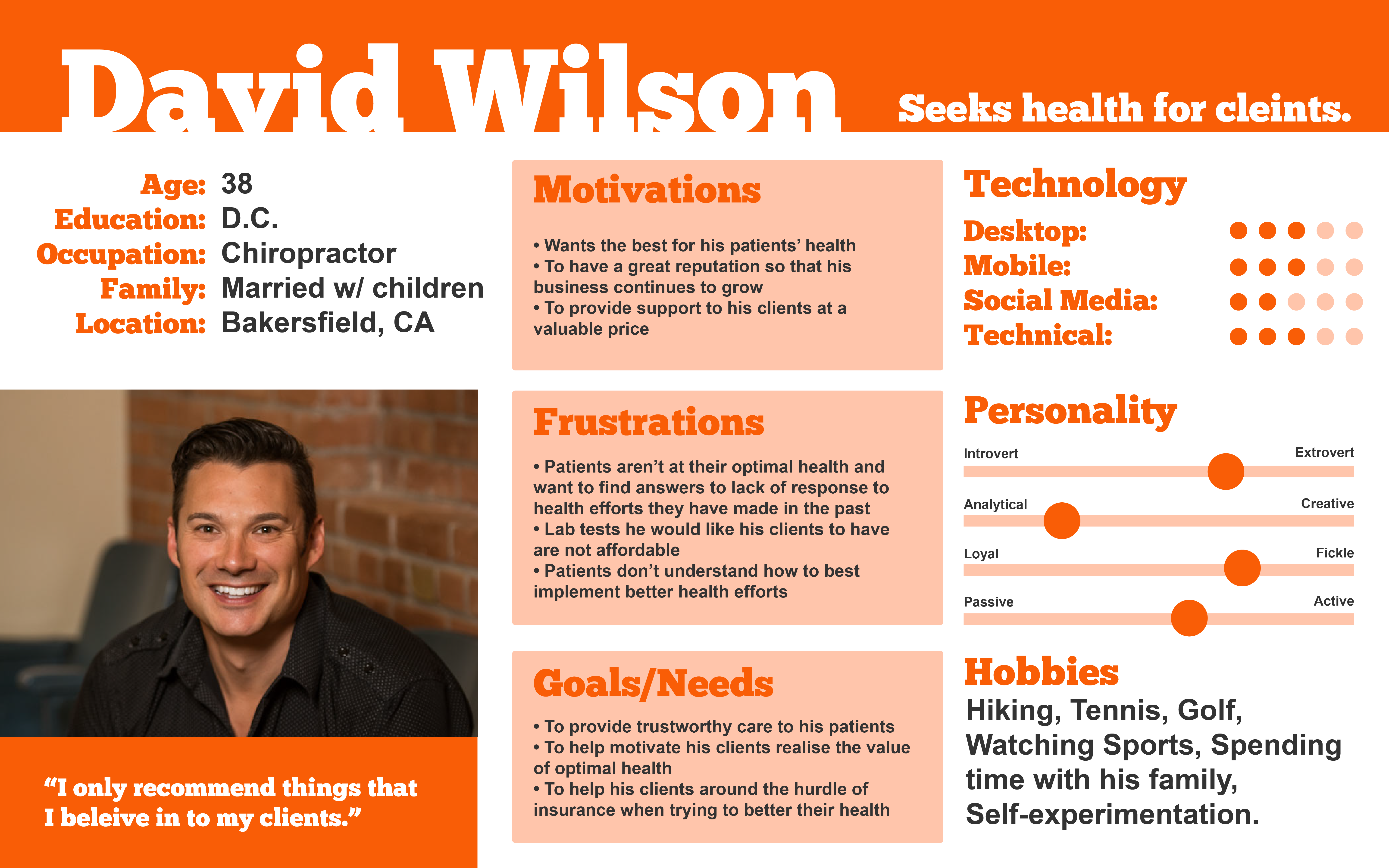
- They seek health for clients as part of their career
- They seek health for loved ones

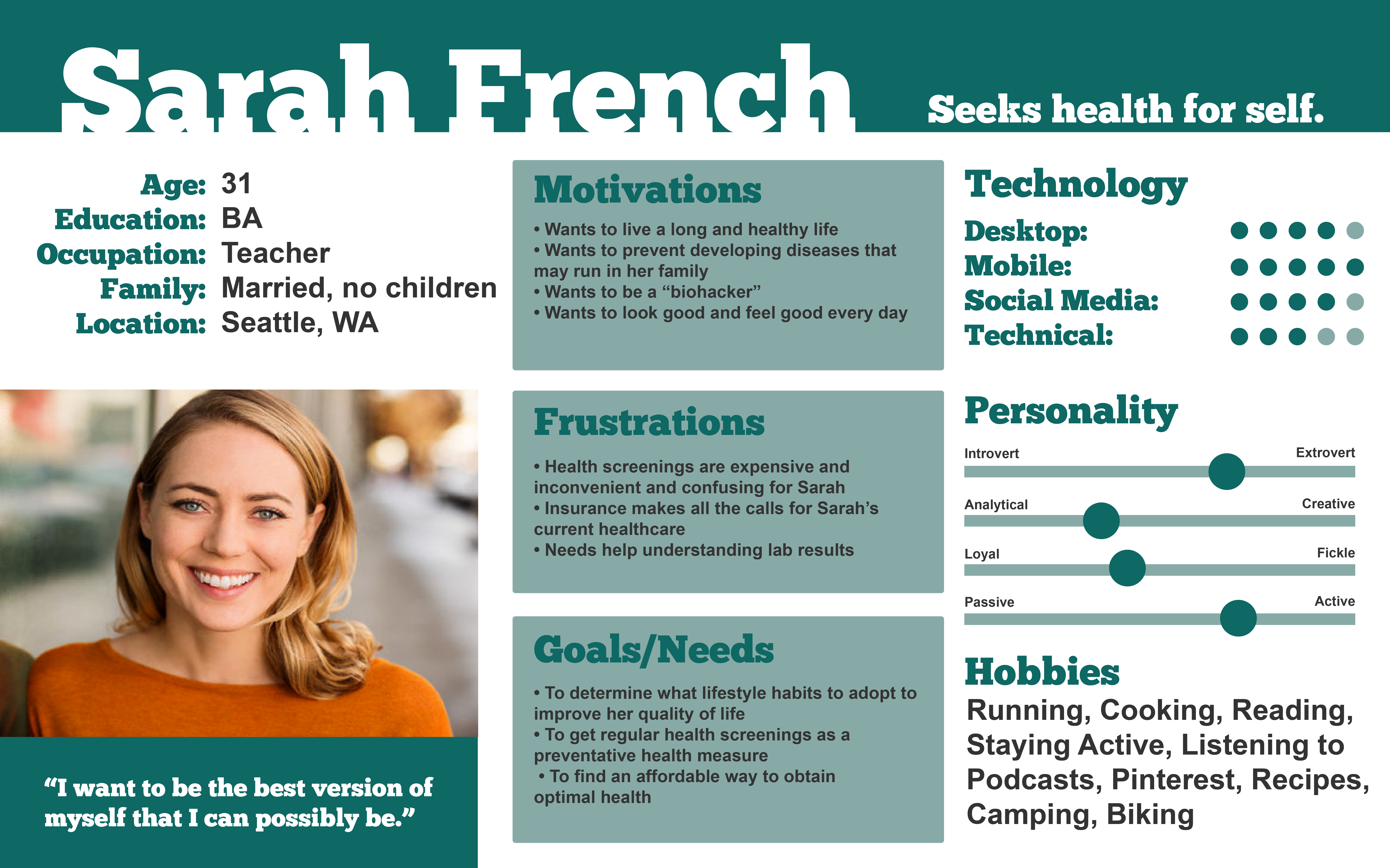
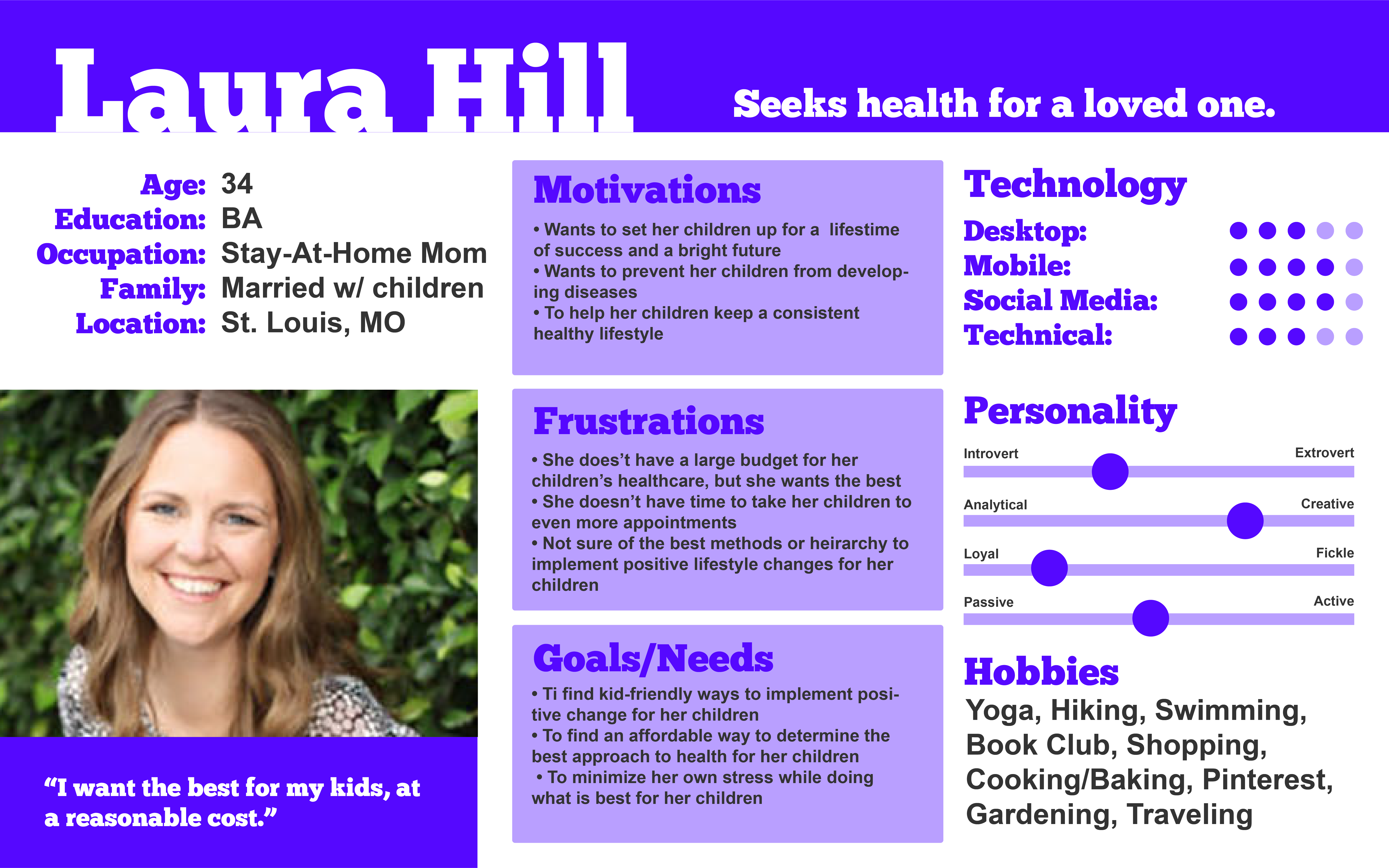
I used the user groups definined in my empathy maps to create three unique personas to keep in mind for the project.
- Sarah: The primary user, who values her health and wants to be able to keep a close eye on improvements she wants to make. It’s important for her to improve her quality of life at the most affordable cost.
- David: A health practitioner who recommends this product to his clients, who can share their results with him so that he can provide the best care to meet their needs.
- Laura: She uses BioBridge to keep track of all the bloodwork for her family. She wants to catch any developing health issues early to make sure her children have a bright future.
How Might We:
To make my problem statement more actionable, I used the insights from my research to develop an action plan based around the following list of “how might we” statements.
- How might we obtain easier access to lab testing for general health?
- How might we reduce the stress of getting blood-work?
- How might we make lab testing more affordable?
- How might we simplify test results to be easier to understand for the consumer?
Ideation
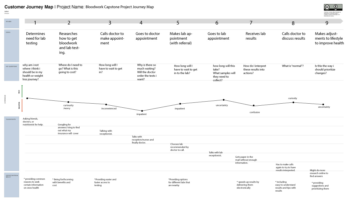
Journey Map:
I created Journey map to show the journal of a typical user seeking bloodwork.
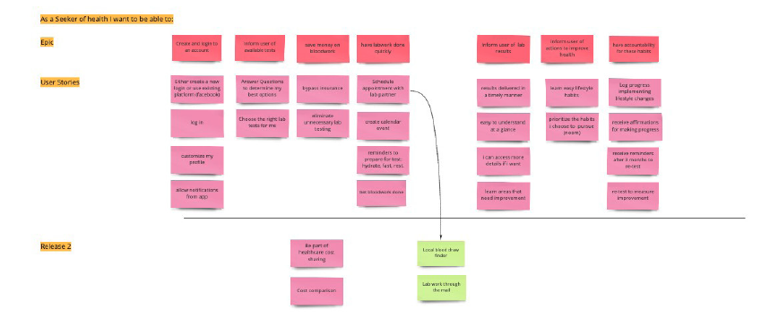
User Stories:
The diagram below shows the user stories based on actions that users would want to take and expect to be able to complete with the product. These played a critical role in ideation.
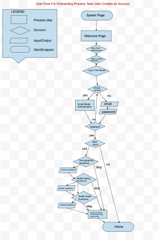
User Flows:
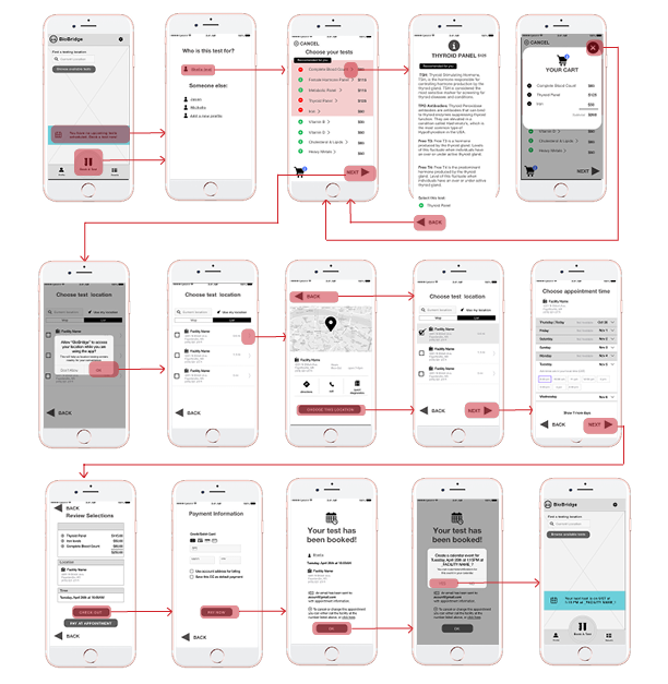
I created user flows to show the journey the user might potentially take when interacting with my product. Then I defined the MVP (Minimum Viable Product) red routes and determined them to be:
- Onboarding
- Booking a Test
- Reading Test Results
I created user flows for these routes and referred to this flow in order to begin to build my screens in the early stages of sketching.
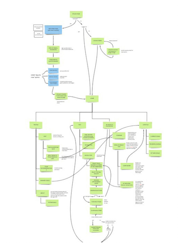
Sitemap
(or App Map)
I started to visualise all of the pages I was going to need to bring the project to life. I created this sitemap to organize these pages into an information structure that would act as the blueprint for the updcoming design.
Design
Sketching:
I heard many times during user interviews that keeping stress low was a major goal for anyone in pursuit of optimal health and wellness. For this reason, I sought simplicity and straightforwardness for the flow as well as the look and feel for BioBridge.
I started with a home screen with navigation icons at the bottom to help the user easily access the route they need. I wanted to keep in uncluttered and add a calming background image to help with that low-stress feel.
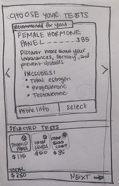
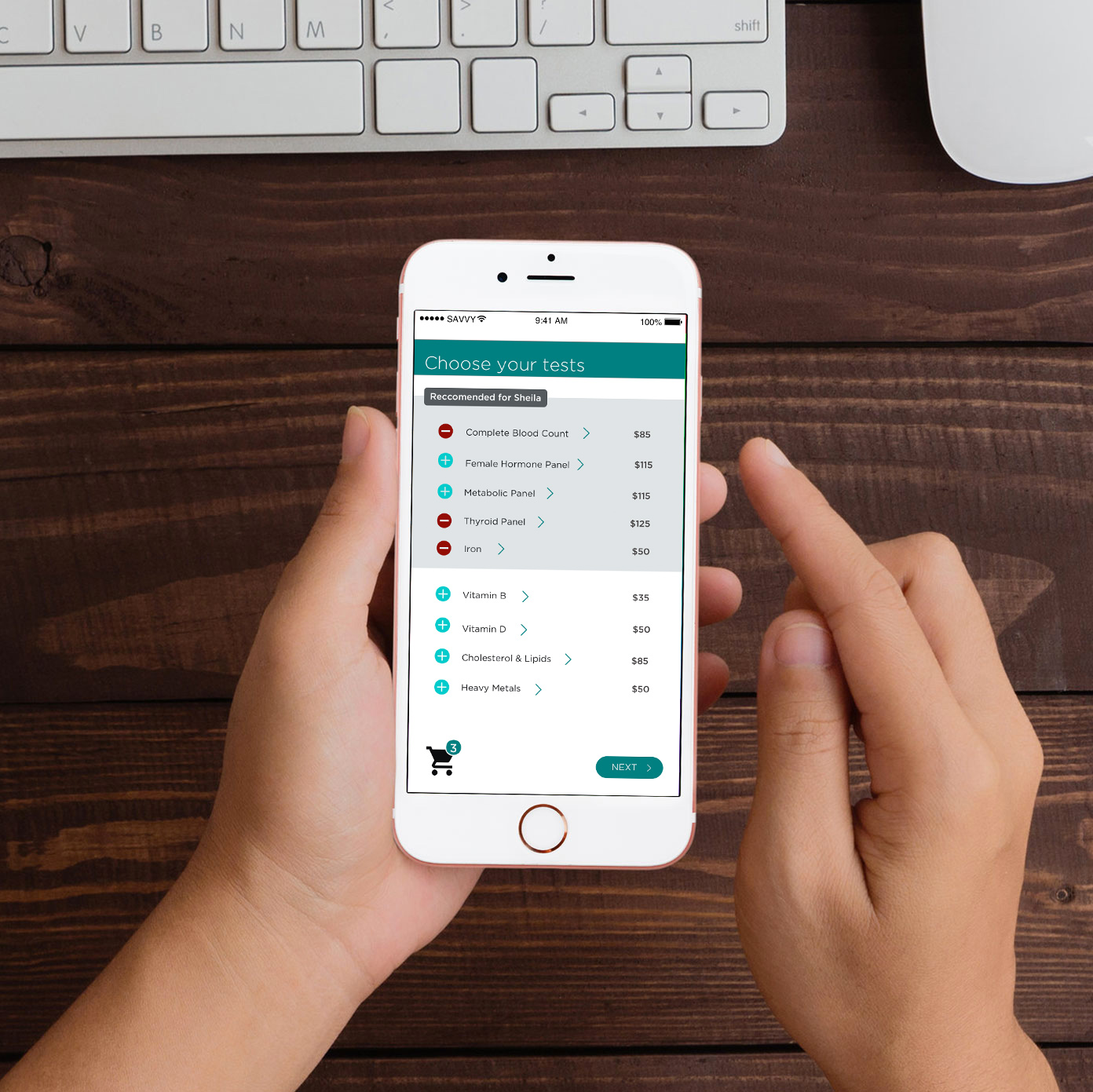
On the test-selector page, I wanted the user to be able to access detailed information about each test while adding them to the cart, and to be able to easily remove them on the same screen. During research interviews, I found that almost everyone had no idea what tests to choose for themselves, so I wanted to provide the education for that within the app. I also wanted it to be clear to the user that certain tests are recommended for them based on their user profile.
Here are a few rough sketches from early phases:

Wireframes:
Sketches turned to wireframes and first testing began. I refined these wireframes with feedback from my mentor, and created a wireflows for my red routes. These wireflows helped me see what the user would experience when performing the red route tasks within the app.
Styleguide:
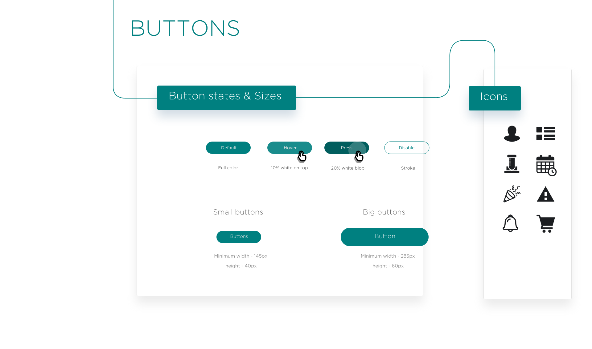
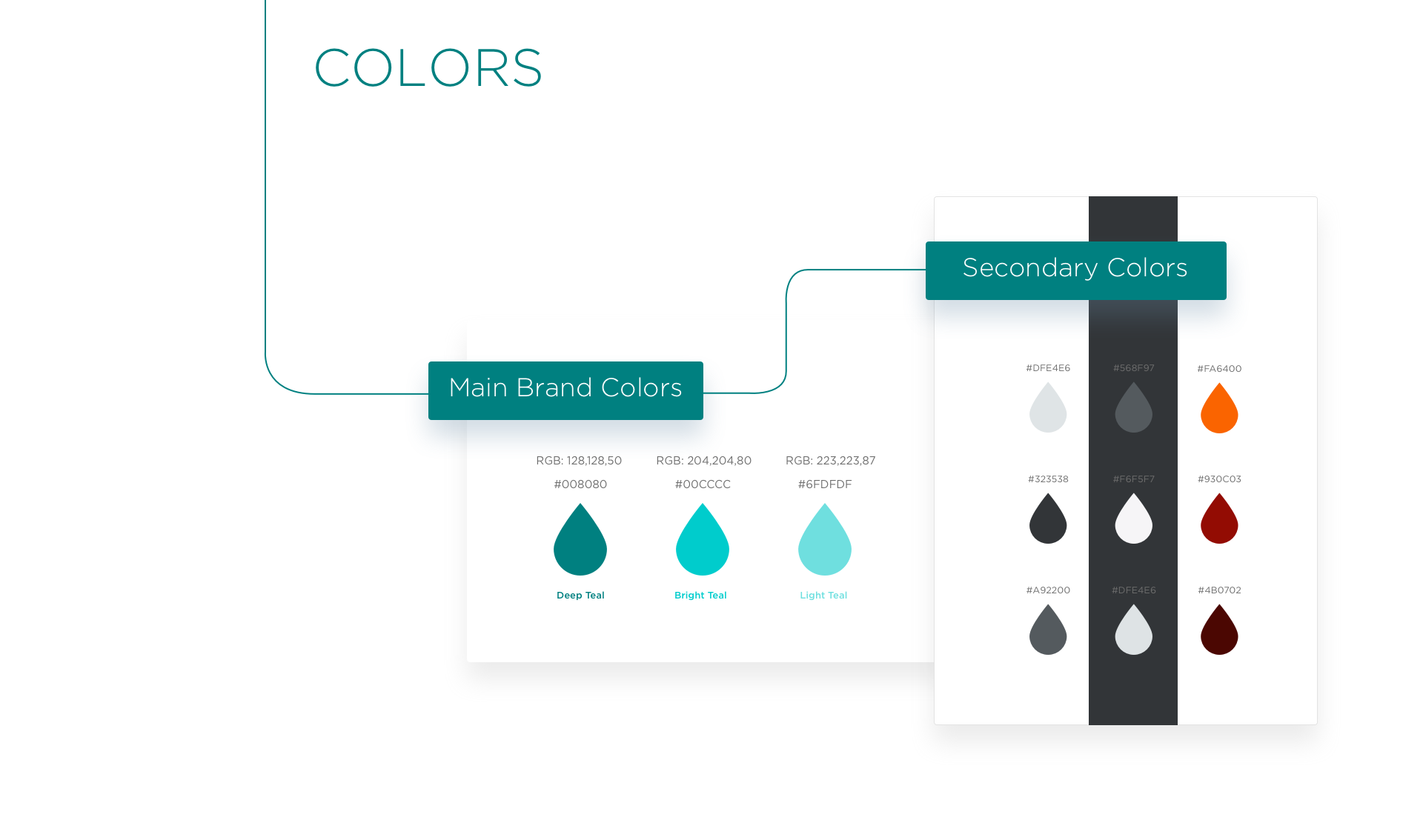
To style the design, I created a moodboard and used it to create a styleguide to apple to my wireframes.
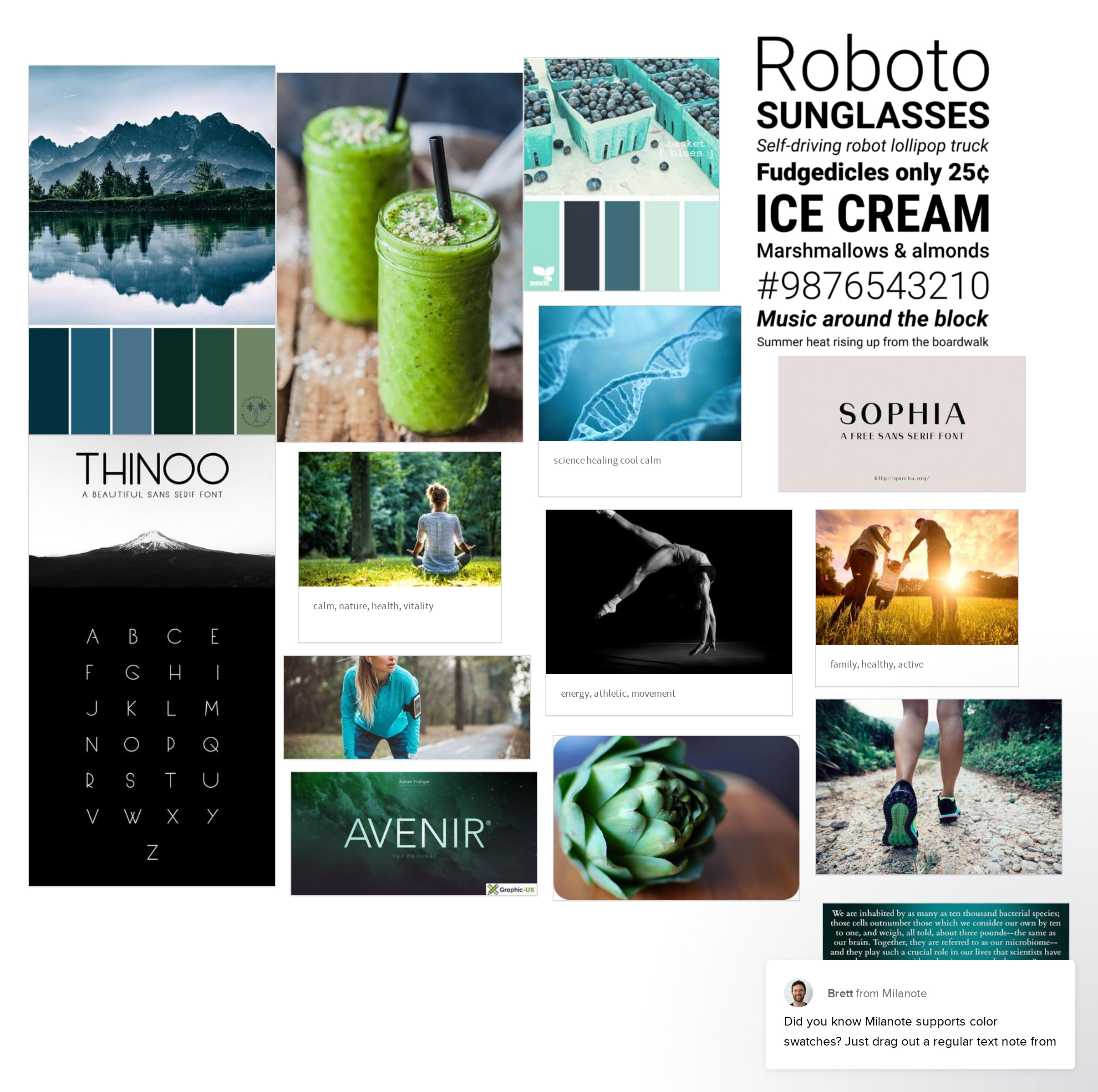
I began with cool tone colors because blue is calming, clean, and serene while green can convey value and saving money. What I also like about green is that it is a color of nature, which is a big part of health. I loved the idea of both blue and green, so I combined them for a teal color to use as the main color. From there, I chose a versatile palette of greys along with some complimentary warm colors to use for warnings and other things that need to grab attention.
I chose a lot of imagery that conveys nature, health and liveliness. The aim of the project is to help people feel their best, so images of people that seem very content, energetic, and active work really well.
I ended up choosing to use one typeface, Gotham, in different sizes and weights. For the buttons and forms, I just kept everything as clean and simple as possible. I wanted to get a very high-tech yet simplistic feel that isn’t too intimidating and feels professional and trustworthy.
Hi-Fidelity Prototype:
Here are some key screens that I created after applying style elements to my wireframes.
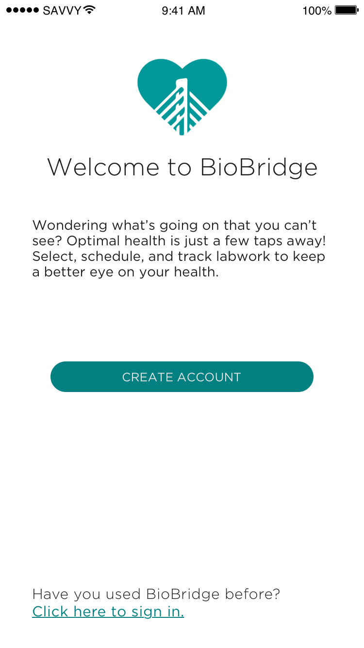
Welcome Screen
My main goal for the welcome page was to introduce users to the app for the first time and allowthem to begin the onboarding process with an option to bypass if they already have an account.
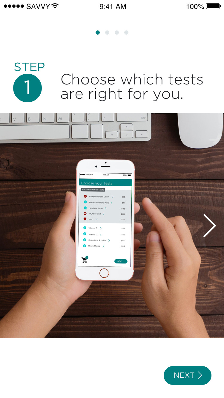
Tutorial Screens
I created a series of tutorial screens that explain an. overview of the appliaction’s capabilities to simplify things and keep eveything clear.
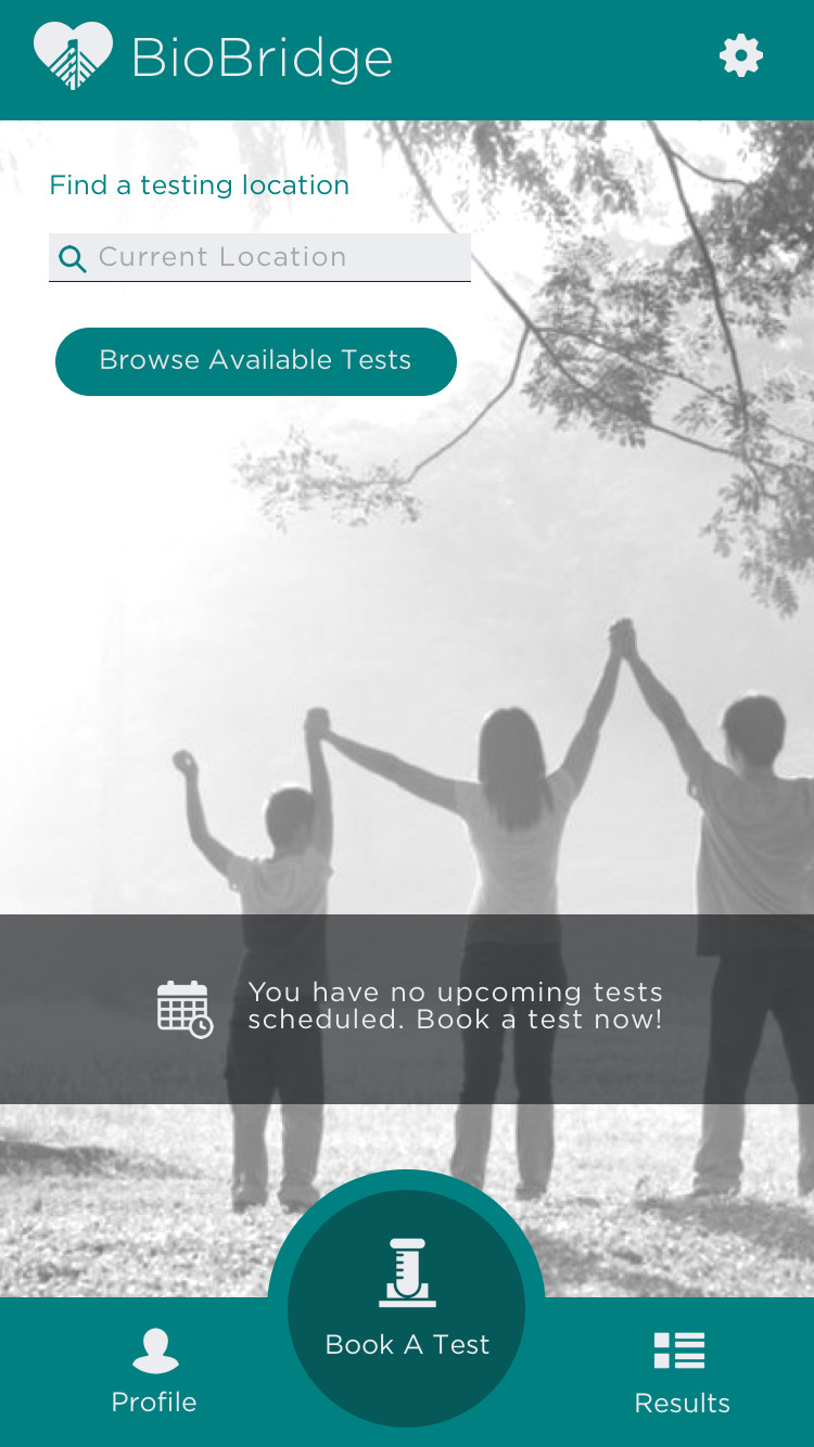
Home Screen
The home screen is introduced to the user after onboarding is complete. The main action is for the user to being booking a test.
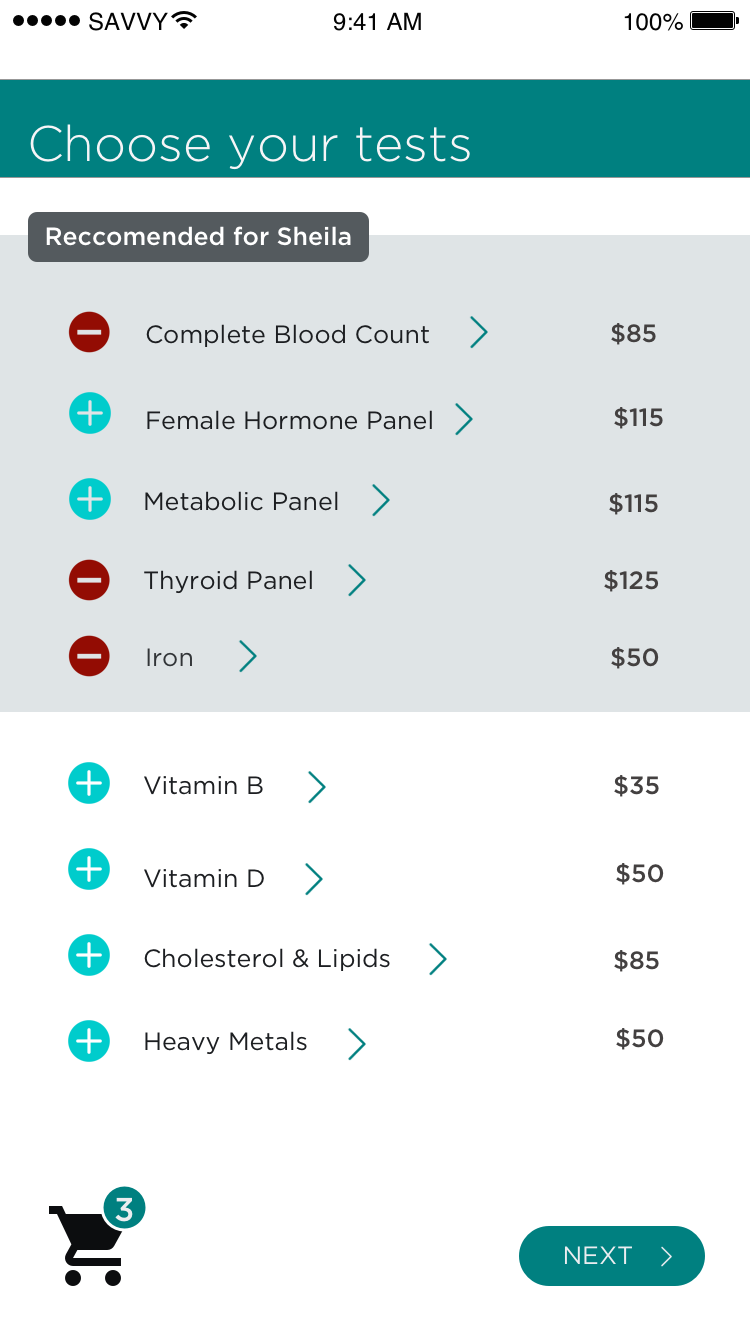
Test Seclection
I wanted users to be able to select tests and also be able to learn more information and details about them while doing so.
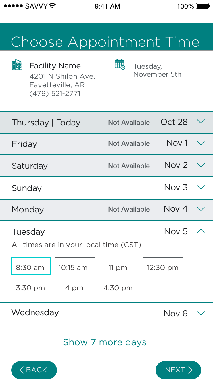

Appointment Time
I had to find a way for users to be able to schedule a day and time that did not conflict with the test location’s schedule.
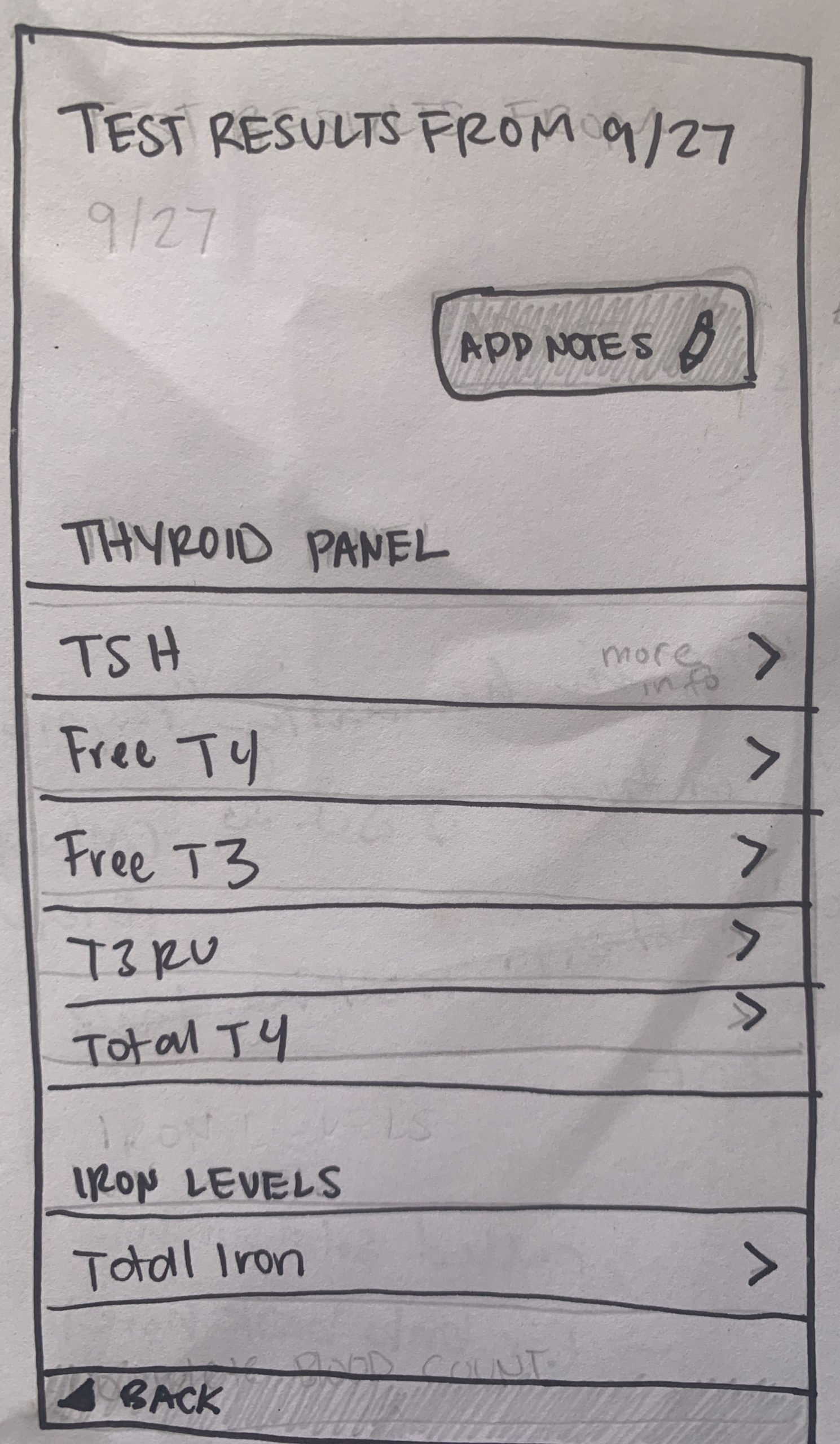
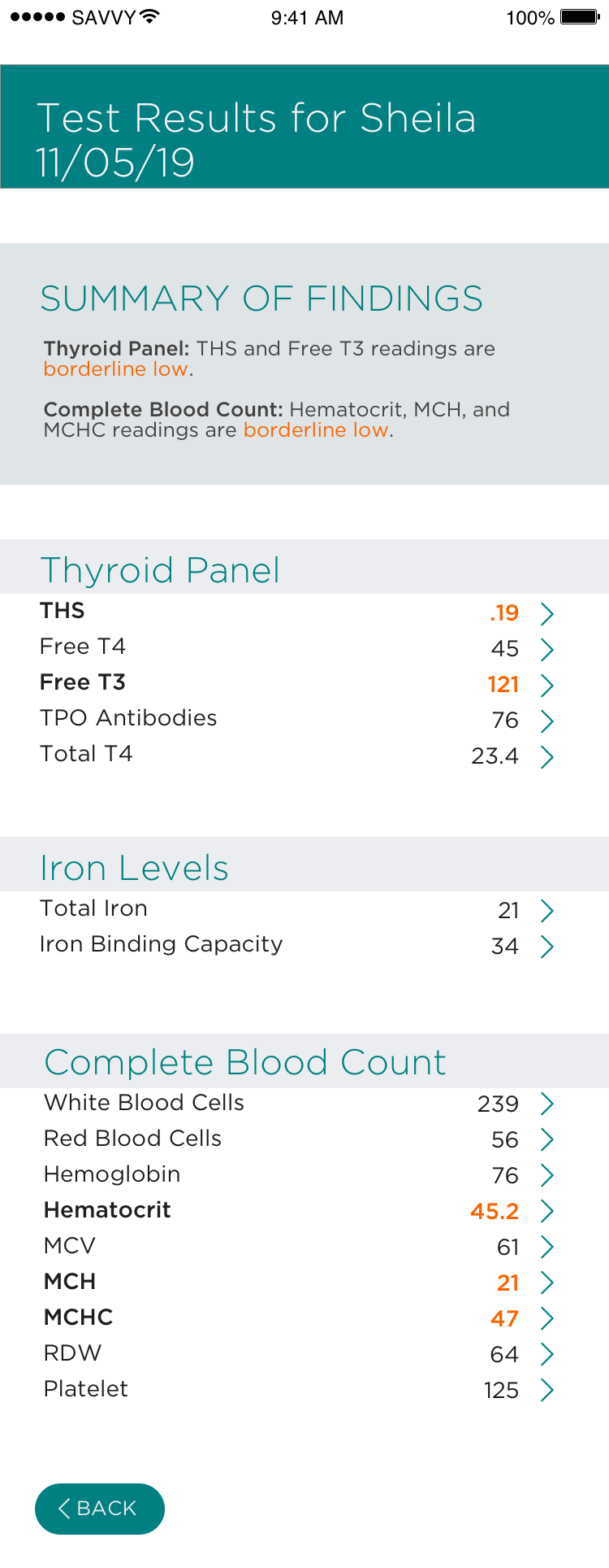
Viewing Results
This screen shows an overview of all the results from the test.
View Details
Once the user clicks on a test result they are taken to this screen to see more detailed information and find out about any potential risks.
Usability Testing
Feedback:
I conducted two rounds of usability testing on my product with a prototype on Invision. The prototype was tested for usability with 5 participants to discover any issues users might have when trying to complete certain tasks. I sought to find out about critical and major issues, but also was happy to make minor updates as well from the feedback I received.
During the first round of testing, the main issues I addressed were the call to action button on the first onboarding screen because users were not gravitated to it when it said “HOW IT WORKS” so I changed it to “CREATE ACCOUNT”. Also The visibility of “continue” buttons on the questions pages - buttons were disappearing on extended screens so that was an easy fix, I just needed to make the screens shorter to move the button up to a visible area.
And one final major issues was clickable hotspot area for the test selection page. I had only made the toggles clickable, and it needed to be the entire word.
During testing, I also received positive feedback. I was told by a few testers that my product was “trustworthy”, “impressive” and even “fantastic”, which was very reassuring for me.
After the first round of testing, I made iterations, and then conducted more testing. I luckily never came across any extremely critical issues that would completely disable a user from completing a task, but I was very happy to discover minor changes to increase the overall experience. This was my favorite type of testing to conduct for that reason.
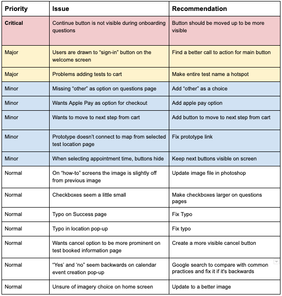
Iterations:
Feedback was organized into critical, major, minor, and normal, and then updates were made to the screens. I could definitely see this cycle being repeated over and over again until the end of time, but after two rounds, anything major was found and resolved.
It’s been fascinating to me to see how these usability tests can provide many new ideas and perspectives that can really increase user experience.
I definitely have learned a lot during this entire process, and hope to continue to build my library of insights to help kick off my new career. I believe I am ready to pass this project off to developers!
Conclusion
Next Steps:
- Connect with testing facilities and develop partnership for discounted testing services for users for BioBridge
- Create database of all testing facilities that approve partnership to be used in the app’s facility search feature
- Work with developers to add code and functionality to the app and test it again
Lessons Learned:
I feel very lucky to have been able to undergo this project through Springboard’s UX Design course curriculum. I’ve learned a lot about UX Design including research, testing, prototyping, and more. I enjoyed using my graphic design skills to make this project come to life, but here are some highlights of things I learned that I was less comfortable with in the beginning.
- I learned a lot about conducting research and staying unbiased and being able to get information from test participants without leading them to the answers. This was a lot more difficult that I imagined!
- I gained a lot of experience in sorting information. I had to create affinity maps and empathy maps as well as getting more familiar with information architecture.
- As a graphic designer, I have a bit of a background in sketching, but was not all that comfortable with sketching digital screens. Now I feel like I’ve jumped over that hurdle and am much better at expressing my ideas for mobile page layouts. I also learned a whole lot about the Design Standards for apple and android devices.
Selected Works
For Oregon StateUX/UI Design
ZwendeCompetitive Benchmark Analysis
Content Creator Education HubUX/UI Design
BioBridgeBootcamp Capstone Project